Alexis Eke works to expand representation through art
 by Meagan Kashty – Sep 22, 2020
 Alexis Eke is soft spoken and thoughtful when talking about her art.
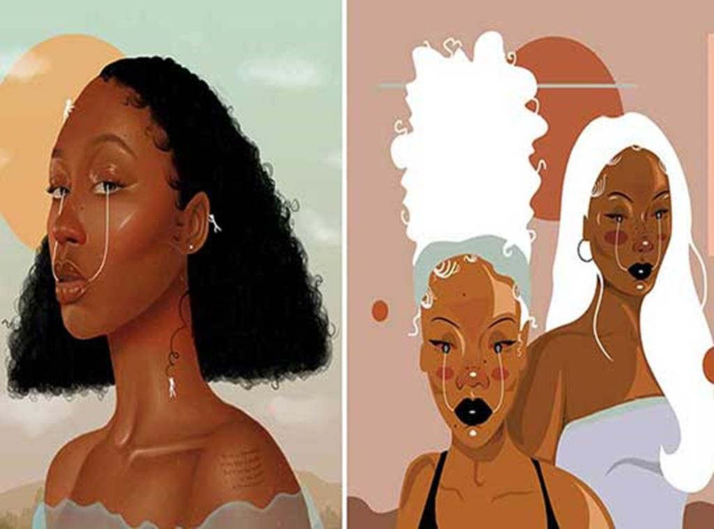
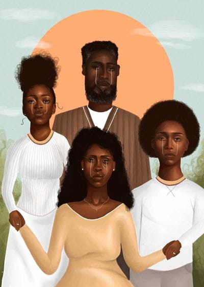
Inspired by renaissance portraits and traditional Japanese art, her collection of work predominantly features portraits of Black women. The pieces are as carefully constructed as her musings, featuring warm, muted colours, and a focus on her subjects’ eyes, with a signature white line running from iris to mouth.
Eke’s portraits may seem subdued, the messages behind them pieces speak volumes.
A 2020 grad of Toronto’s York University/Sheridan College Program in design, Eke’s focus as an artist is to amplify the voices of Black women in Canadian art. Raised in a home where creativity was nurtured – Eke’s mom, Rachel Parray, is also an artist – her portraits of independent, resilient Black women aim to reflect her own personal and cultural experiences.
“I want to expand the representation of Black female artists, especially (in Toronto),” she says. “I’m hoping to encourage younger, Black artists to pursue this field.”
Eke does not shy away from activism within her art. In June, she released a print titled Waters, depicting a Black woman with the Bible passage “Let Justice Roll Down Like Waters” printed on her body. All proceeds from the print sale were donated to Chris Redd’s COVID-19 Protest Relief Fund, which assists those that contract the disease while protesting.
She’s also collaborated with Pique, a Toronto-based production studio, to create a colouring book, with all proceeds being donated to Nia Centre for the Arts – a not-for-profit arts centre that supports, showcases and promotes an appreciation of arts from across the African diaspora. The book, titled “Hope You’re Well” contains illustration by Eke and Bible verses meant to inspire calmness.
At 22, Eke’s work has been featured on CBC and Breakfast Television, and her clients include Adidas, Bloomberg, AGO and Nike Jordan.
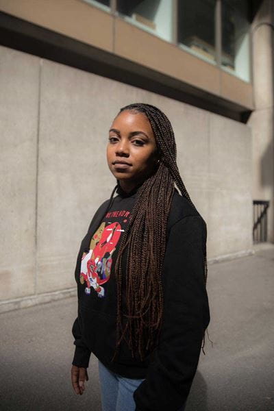
Most recently, after being commissioned by the NBA to create an illustration celebrating Vince Carters’ retirement, and working with Sportsnet on a piece highlighting race and racism in women’s hockey, Real Sports Apparel asked Eke to design T-shirts and hoodies for the Raptors playoff season. “It was about coming up with a concept that communicated unity and community, and a love of basketball,” Eke said in a previous interview. “I’m also a big fan of intricate and bold T-shirt designs, so that’s what I wanted to incorporate. The other thing I wanted to include in the work was my style, of course, and the white lines because that’s something that when people see my work, they recognize.”
We chatted with Eke about her inspiration and career so far:
What prompted you to make the focus of your work on the representation of Black women?
I made that my focus due to personal experience. When I was younger, in middle school, but in high school as well, I wasn't really taught about or exposed to contemporary Black female artists in Canada. And because of this, I felt a bit intimidated to go into design professionally because I didn't really think that there was a space for me. So the work I do now, I want to kind of encourage young Black girls to confidently pursue a career in design if that's what they’re passionate about, and let them know that there's definitely a space for them to have their work seen and for their work to succeed.
What have been some career highlights for you so far?
You've also worked with a lot of corporate clients. What were some of your first steps to break into that world?
I’ve always been consistent about putting my work out there. And through that, I’ve been able to make connections with a lot of amazing people who knew my work. I think that once you have that first commercial project, more people see your work and get to know who you are.
Working with Nike, Canada Goose and The Kit were big, because there were new experiences attached to those projects.
Nike was my first commercial project ,and that was a new experience because I’ve never done a project to that scale before and it was a milestone in my career.
And then with the Canada Goose project, that was my first window display, and it exposed me to possibly being more interested in that type of art in terms of making set designs and installations. Lastly, with The Kit, that was a special project because it was the first time I was printed in the newspaper – it was amazing to actually hold my work in print.
I’ve noticed that in the last few months, you’ve done a lot of work in the athletic space, whether it be with Sportsnet, Nike, or Adidas. How did that come about?
It wasn’t a conscious effort. It was definitely something that just caught me by surprise a bit, but it wasn’t something I was opposed to because I’ve always loved playing sports, so I was open to bringing my style to an athletic space.
I try to make my pieces that are more on the athletic side bold rather than the soft, muted colours I use in my most of my pieces. I’m not sure exactly why I go that route of making these sports-related pieces so bold, but I think a part of it might just have to do with me being a Black, female artist. It’s about wanting to be bold – not forcefully – but bringing that representation to an athletic space.
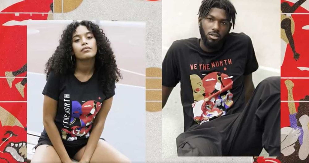
Can you talk a bit more about the Raptors playoff collection and how that came about?
Real Sports Apparel reached out to me about designing some shirts and hoodies for the playoff collection, and I was completely on board because it was an amazing opportunity. The design process was really fun, but I did learn a lot from it. The Raptors have a very solid branding system, so it was a learning curve to find a solution that would incorporate my style into something that was already so solid and well thought out. When I started making the design, I started by making sure the brand guidelines were fulfilled first and then finding some loopholes or small areas where I could incorporate my own details and colours and layouts.
They told me they loved my work and thought I’d come up with amazing concept. I think because they knew they already had a branding system in place, they didn’t put any restrictions on me when it came to the concept. They wanted to give me a bit more freedom into how I wanted the piece to look.
The fact that I’m able to make something that people are going to purchase and wear that celebrates the Raptors – it’s an amazing moment.
Earlier in our conversation, you noted that were hesitant to pursue a creative career because of the lack of acknowledgment of Black women in the art world. What advice would you have for young Black girls now who are looking to pursue a career in art?
If you are passionate and have a vision you want to show the world, go for it. Regardless of how you physically look or the colour of your skin, your talent will speak as well. The process of how things will turn out in this industry is different for everyone, but we need you. We need to see more Black women and girls in the art world. Just the fact you’re there in the industry makes a really large impact. More than you might even realize.
This interview has been edited for space and clarity.
Written by: Meagan Kashty, Manager, Communications and Public Relations at Sheridan.
Media Contact
For media inquiries, contact Sheridan’s Communications and Public Relations team.


